 So you turn on your TV, and your local meteorologist shows you the current weather map. And there's all sorts of red and blue (and sometimes even purple!) lines on the screen. It's not like you can go outside, look up, and see a thick blue line crossing overhead.... so what do they stand for?
Short answer: They signify where a frontal zone is located.
Now I can hear you saying, "But what exactly is a front?" Find out after the jump!
Meteorologists generally determine the existence of a front based on 3 criteria:
1.) Potential Temperature Gradient
Considering that meteorologists usually classify fronts by the relative temperature of the advancing air (more in Part Two), the existence of a temperature contrast is necessary in the development of a front . However, verifying that a strong contrast does exist is not as simple as it might first seem, because of elevation changes. For example, mountain cities as Denver are usually colder than cities in the Great Plains, such as Lincoln. Using simply surface temperature means that we would always see a cold wave of air pushing from the Rocky Mountains into the Great Plains, which is not real, just a side effect of the elevation change.
Meteorologists address this issue by defining and calculating a new form of temperature, potential temperature (AMS Definition). A derivation and explanation of potential temperature can be found here, as it is much too complicated to expand upon in this simple post. Suffice it to say that potential temperature acts to equalize surface temperatures by accounting for the elevation (and therefore pressure) the surface is at.
With a level playing field, the potential temperature is then plotted on a contour map, much like you would make a map of local terrain for example. The closer the lines are together, the stronger the gradient (the quicker it changes) of potential temperature in that area. Below is a surface potential map of the United States:
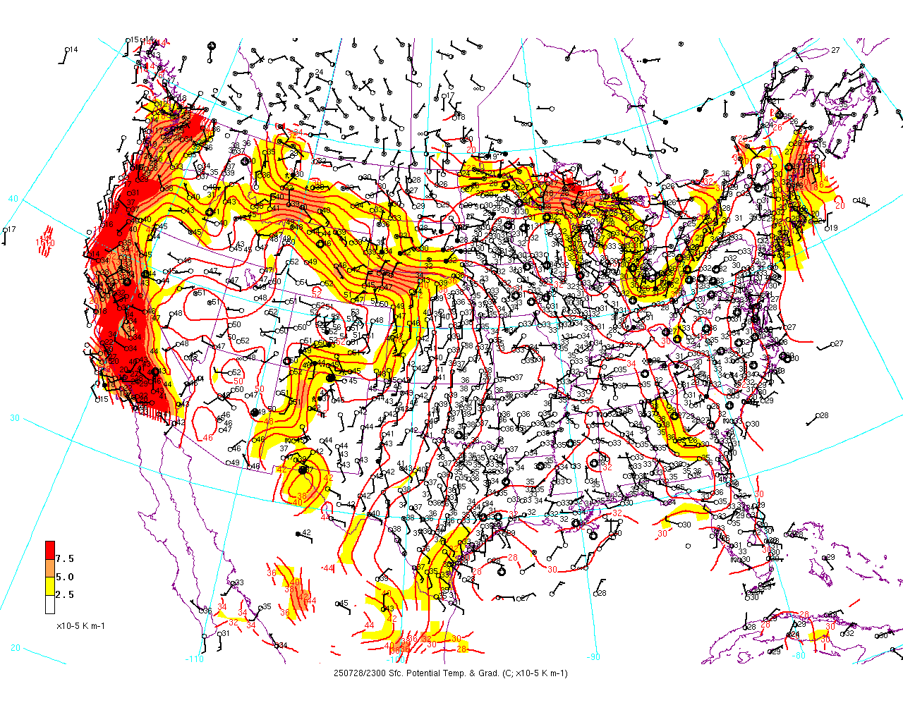 |
| Credit to University at Albany for map |
So, we've got our temperature gradient....what else do we need?
2.) Wind Shift
Along with the above temperature gradient, we also need a wind shift to take place. Thankfully, this criterion isn't as complicated as potential temperature. Meteorologists classify winds by where they are coming from, not where they are traveling to. So an north wind would travel from Canada into the United States, and a south wind would travel from the United States into Canada.
 Now while there are usual wind directions at any given location (usually a westerly wind for most of the United States), fronts can change this as they move through. Therefore, meteorologists look for a 45° shift in the wind direction over a 3 hour period in order to fulfill this requirement. Why does such a wind shift occur? To the right you'll find the typical wind patterns in a low pressure system.
Notice that behind in each portion of the storm, the winds are blowing a different direction: red arrows with a southwest wind, dark blue with a northwest wind, and light blue with a generally easterly wind. Depending on which sector you are in, your wind direction is different. So, to switch sectors (and thus wind directions), a wind shift must have occurred at the boundary, which we call a front.
Well, that's two....what do we have left?
3.) Isobaric Kink

Since there is no measure of how kinked an isobar may be, there is no objective standard to hold the isobars to. Thus, this criterion is often approximate, although it is often visible on surface analysis, and especially with strong frontal zones.
So, there you have it...the three criteria for determining a front. All three must be present in order to accurately declare that there is indeed a frontal zone on a surface map.
But while fronts have these same characteristics, they are also all different, as evidenced by the different symbols used to denote on front on your local meteorologist's weather map. What are different types? We'll cover that in Part 2!
No comments:
Post a Comment